When it comes to boosting the profits of your online store, you must increase two major factors, i.e., website traffic and conversion rates.
While the number of people visiting your website varies depending on the size and type of product/service you offer, your average conversion rate must be above 3% to ensure great returns on investments (ROI).
Therefore, it is important to make an effort to increase the conversion rates of your online store.
What is a Conversion Rate?
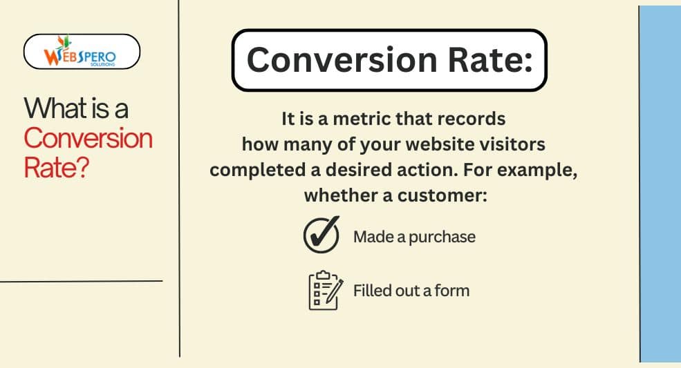
Before we get into the specifics of how to increase conversion rate (CVR), it is important to understand what it is exactly.
It is a metric that records how many of your website visitors completed a desired action, i.e., made a purchase, clicked on an ad, filled out a form, or more. In simple terms, the conversion rate is the percentage of your users that converted into customers.
What is an eCommerce Conversion Rate?
When it comes to online retail stores, the number of people who placed an order or made a purchase compared to your overall traffic is referred to as the eCommerce Conversion Rate.
Different platforms address this differently. In Google Analytics, it is called eCommerce Conversion Rate, while Shopify Analytics refers to it as Online Store Conversion Rate. Other platforms or tools may call it Transaction Rate or Order Rate.
If you are looking to increase your web store’s traffic, then you can opt for these tips
How to Calculate Conversion Rate?
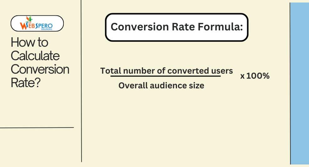
To calculate the rate of conversion, simply divide the total number of converted users by the overall audience and then change that figure into a percentage.
Conversion rate = Total number of converted users/overall audience size x 100%
For example, if you have about 1,000 people visiting your online store, and out of them 50 people purchased something, then, you will have a conversion rate of 5% (which is amazing by the way).
To help you make the calculations easy, you can use our accurate and free Conversion Rate Calculator.
Why Conversion Rate Matters?
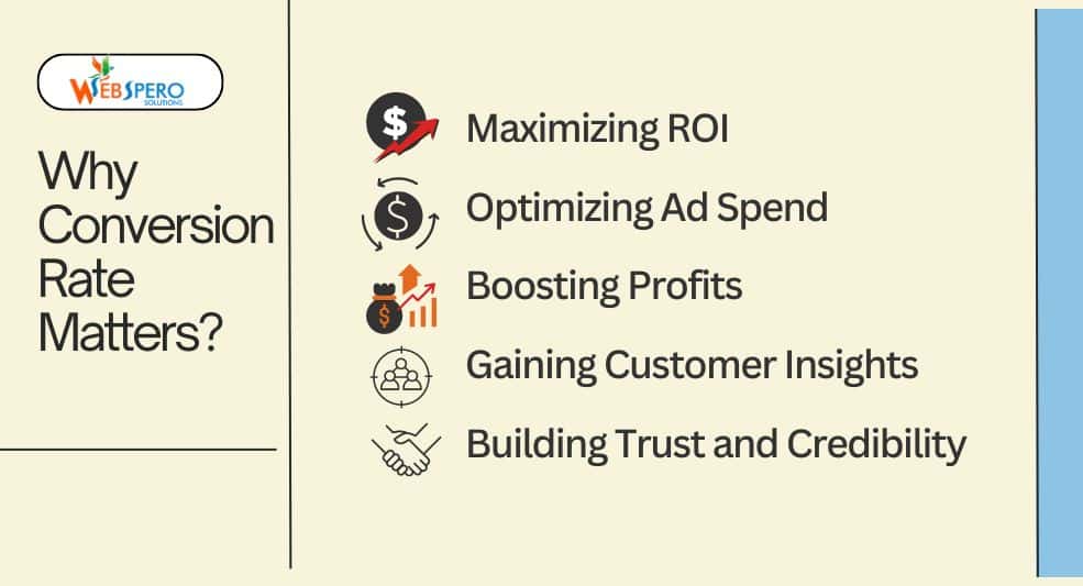
Now, you know how to calculate CVR; however, it is also important to know why it matters.
In addition to being an essential indicator of how well your website is performing in terms of turning visitors into paying customers. Here’s why they matter:
- Maximizing ROI: A higher conversion rate means you’re getting more value from the same amount of traffic. Essentially, it helps you get more bang for your marketing buck, improving your return on investment (ROI).
- Optimizing Ad Spend: With a better conversion rate, you don’t need to spend more on ads to bring in traffic. Instead, you make the most of your existing visitors, lowering your customer acquisition cost (CAC) and improving the efficiency of your ad campaigns.
- Boosting Profits: The higher your conversion rate, the more revenue your store generates. Even small improvements in CVR can lead to substantial gains in profit, especially in the long term.
- Gaining Customer Insights: Tracking conversion rates can help you understand your customers’ behaviors better. By analyzing which products, pages, or actions lead to conversions, you can fine-tune your website and marketing efforts for better results.
- Building Trust and Credibility: A strong conversion rate often signals that your website is providing value, is user-friendly, and has gained the trust of its visitors. All of these elements play a role in creating a loyal customer base.
What Is A Low Conversion Rate?
When a low number of visitors are performing the desired action, then it is considered a low conversion rate. For instance, users are not making the final purchase on your online store.
Remember how we mentioned that a CVR above 3% is considered great? It is true; however, if your competitors are able to achieve a constant CVR of 8%, then you must improve your conversion rates.
Here are CVRs among different industries.
Possible Cause for Low Conversion Rate
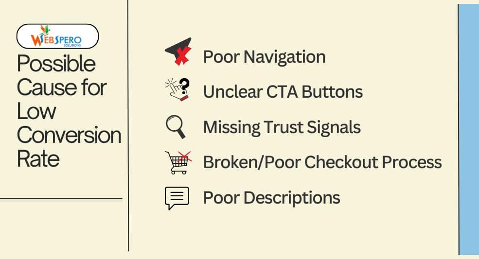
It is one thing to sell excellent products or services; however, those are of no use if your users are not converting. These are some of the most common reasons for low conversion rates:
Poor Navigation
Before users are even able to make a purchase or take the desired action, it is important to understand how easy it is for them to navigate your website. If the website has poor navigation or complex menus, chances are they will leave the website way before taking the desired action.
That’s why it is one of the most common causes of high bounce rates.
| What is Bounce Rates?
It is the percentage of users that leave the website after viewing only one page. |
Therefore, it is important to test every element carefully to see if they are working properly and how easy it is to navigate your website.
It’s also important to keep up with the design trends. For instance, currently, mega menus are in trend, these provide more information compared to hamburger style menus.
Unclear Call-To-Action (CTA) Buttons
It does not matter what action you want your users to take, if the CTA button is unclear or difficult to reach to, CVRs will plummet.
Sometimes, the action button is blended with the background. Other times, the secondary button and CTA button are given equal weightage, confusing the users or reducing the chances of conversion.
For instance, your landing page has two buttons: a Sign Up (primary CTA) and a Learn More (secondary action). If both buttons are the same size and color, users might get confused about which action is more important.
Missing Trust Signals
Social proof is essential for sales, and trust signals act as proof of financial security for potential customers and build trust. Therefore, it is very important to highlight these signals on your homepage.
| What are Trust Signals?
Trust signals are elements on a website, like security badges, customer reviews, or testimonials, that help reassure visitors your site is safe and reliable. They build confidence, making users more likely to trust your business and complete actions like making a purchase. |
Not having or poorly implemented trust signals like security badges and customer reviews can result in users being hesitant to complete the desired action, lowering your CVRs.
Also, avoid showing generic reviews on product pages because customers expect specific, authentic, and relevant reviews.
Broken or Poor Checkout Process
If the checkout process is complex, shady, or takes too long, chances are the users are likely to convert and abandon the website. Even if they do make a purchase, they won’t be returning.
Other factors, such as missing trust signals at the checkout page, limited payment options, and unexpected shipping fees, can lower your CVRs.
Poor Product/Service descriptions
Simply stating what the product is made up of or mentioning that you offer the best service won’t cut it anymore.
Customers want to know how your product/service will solve their problem, and they look for that information in the description section. If it isn’t present, they are unlikely to convert.
For instance, if you sell recliners and you mention foam material and reclining levels but don’t mention how comfortable it is and how it supports their legs and back, chances are users will not be interested in the product.
Low-Quality Images
Not having a clear visual understanding of a product can deter users from making a purchase.
Similarly, adding stock images instead of actual product images can make you appear as a non-trustworthy seller.
How To Diagnose Low Conversion Rate
Now, you know the common causes for a dip in conversion rates. Let’s see how to diagnose the issues.
Gain Insights from Customers
Nobody understands your customers better than your customers themselves. Therefore, it is ideal to directly gain insights from your customers by conducting formal interviews and asking them questions like:
- What made you buy this product?
- Did it solve your problem?
- Were you concerned before purchasing the product?
This way, you can gain valuable insights which you may not find on your website. Additionally, exactly why people are interested or buying your product. For example, you may discover that people are buying from you because you don’t charge for shipping instead of the USP of your product.
Analyze Your Website’s Data
Data and customer interviews go side by side to provide you with concrete evidence of what your customers want. This is because a customer may respond that they love your blogs; however, the data might indicate that they spend more time on product pages.
This way, you can pinpoint the exact issue in the customer funnel and fine-tune it. You can use tools like Google Analytics for this process. There are two ways to segment and compare the data:
Pages
Segmenting your data by page can help you understand which page performs the best. This can further help you analyze user behavior and structure your site’s navigation accordingly.
Traffic Channels
These help you understand what type of traffic is likely to convert. It can help you refine your overall traffic strategy, attracting high-quality traffic for better conversions.
Audit Your Techincal Setup
Technical issues like slow-loading pages, poor mobile optimization, and broken links can deter away potential customers.
A thorough SEO analysis can help you identify exactly what technical issue is negatively impacting your CVRs.
A/B Test Buying Journey
Experimenting with different parts of the buying funnel can help you identify what your customers prefer. This can further help you create strategies to optimize your conversion rates. You can test different elements like photographs, CTAs, product descriptions, and more.
How To Boost the Conversion Rate?
Once you’ve discovered what is causing low CVRs on your website or ad campaign, you can work on improving. Following are rate optimization tips that helped us increase conversion rates for our client by 53%:
Define Your Website’s Goal
First things first, you have to define your website’s goal and decide exactly what you want to achieve. For instance, completing a purchase or signing up for a newsletter.
Once you’ve defined a clear goal, regularly assess the progress of your conversion rates. You can either discuss your website’s CVR goal with an SEO expert or set it yourself. Here are some examples of conversion rate goals:
- Boost website conversions by 4% in 3 months
- Take the conversion rate from 1.2% to 2% by the end of Q3
Optimize Navigation
As mentioned above, poor navigation is one of the most common causes of low conversion rates. Therefore, it is important to ensure that visitors coming to your website can easily find what they’re looking for.
To do so, to ensure your website is intuitive and user-friendly. Focus on increasing usability, increasing the likelihood of your visitors to convert. Here are our proven ways to optimize your website navigation:
Use Short, Descriptive Menu Titles
By providing crisp and to-the-point information about the product, you engage customers and provide them with all the details they are looking for in one place. It aids in product discovery and increases the likelihood of the purchase (Research by Marc L Resnick & Julian Sanchez).
Use Mega Menus
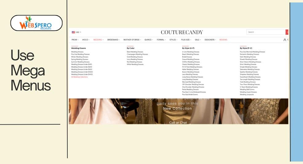
Mega menus are a brilliant way to show a large number of products and categories to your customers, compared to traditional menus, making website navigation easier.
Cater to Mobile Phone Users
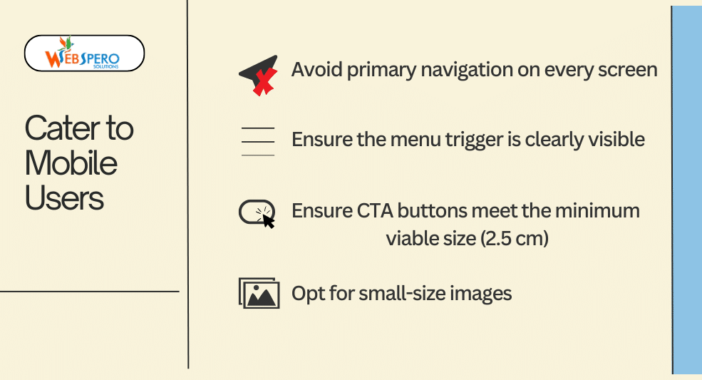
Mobile phone users dominate the eCommerce market at a whopping 66% and 77% in order share and traffic share. Therefore, it’s important to design your website navigation to cater to phone users. However, the problem here is that you have limited space. Here are our proven tips for creating the ideal experience for phone users:
- Avoid primary navigation on every screen
- Ensure the menu trigger is clearly visible
- Ensure CTA buttons meet the minimum viable size (2.5 cm)
- Opt for small-size images
Provide Search and Product Filter Options
Advanced product filters and search options can significantly enhance the user experience. By providing these options, you make it easier for users to conduct internal searches and find exactly what they are looking for. You can use heatmaps and Google Search Console (GSC) to gather data on user behavior.
| Tip: Provide your most used filters on top. |
Enhance Product Page UX
Once you’ve optimized your navigation, it is important that your product page is pristine to ensure that visitors convert, and you can achieve it with careful UX design choices. Implement these tips to create a product page that converts:
- Add high-quality visuals and icons to quickly familiarize users with the product and highlight its USPs. You can also highlight your store-specific features like free shipping and special offers.
- Ensure that you keep product descriptions concise but informative. Focus on benefits, address FAQs, and use bullet points.
Make sure you implement clear and strong CTAs like “Buy Now” or “Checkout.”
Send Abandoned Cart Emails
This is specifically applicable to eCommerce websites. The average abandoned cart rate is 70.19%.
If users are abandoning your website with products in the cart, then it is highly recommended to send them abandoned cart emails.
Jai Prakash Chamoli, an eCommerce SEO expert, says, “Abandoned cart emails are a crucial step in ensuring the user completes the purchase and converts. In my experience, I’ve seen abandoned cart emails work wonders for this [abandoned cart] issue. These [abandoned cart emails] usually hover around a 30% click-open rate and 20% click-through rate.”
Make The Checkout Process Easier
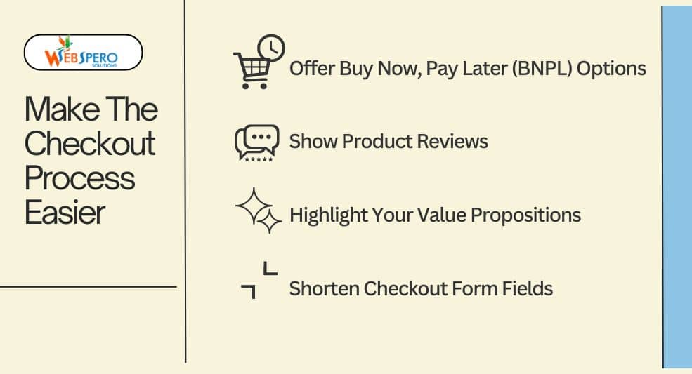
If GSC and heatmaps show that users are abandoning checkout pages, chances are you have a complex checkout process, limited payment options, or missing trust signals. Here are our proven ways to make the checkout process easier:
Offer Buy Now, Pay Later (BNPL) Options
As the name suggests, this option provides flexible payment options. This eliminates the hesitation a user might have to make a purchase, increasing conversions.
Show Product Reviews
Displaying genuine and relevant reviews during checkout reassures buyers that they’re making the right decision. Authentic positive feedback right before purchase can reduce cart abandonment.
Highlight Your Value Propositions
Whether you want visitors to fill out a form or make a purchase, it is important to highlight what you offer that sets you apart. You can conduct A/B testing to better understand and improve your value proposition.
| NOTE: If your users are genuinely interested in your service or product’s value, then they might also overlook technical issues. |
Shorten Checkout Form Fields
People do NOT like to take additional steps or fill out unnecessary fields when they are shopping. The more fields a customer has to fill in, the more likely they are to abandon the process. Therefore, keep it short and ask only for essential information. Offer autofill options and guest checkout to speed things up.
Optimize for Mobile
As mentioned above, mobile users dominate all industries, especially the eCommerce market. This is how you can optimize your website for mobile devices.
| Tip: Instead of designing your website for desktop and mobile devices separately, you can opt for Responsive Website Design. |
Main Categories in Navigation Link Bar
In addition to the tips mentioned in the Optimization Navigation Section above, make sure the most important product categories are prominently displayed in your mobile navigation bar. This reduces friction and helps users find what they’re looking for with fewer clicks, improving their browsing experience.
Prominent Search Bar
For similar reasons to adding main categories in the navigation link bar, make sure you offer an easy-to-use and consistent search bar for mobile users. Place it at the top of the screen so customers can quickly find specific products without endless scrolling or clicking through categories.
| Tip: Enable a double-tap or quick scroll option to reach the top of the page quickly. |
Offer An Incentive
According to experts, 60% of users won’t complete a purchase if free shipping isn’t offered. This is why it’s crucial to offer some sort of incentive to ensure the users convert.
You can provide incentives like:
- First-time discount
- Free shipping
- Discount above certain cart value
Fix Technical Issues
Poorly optimized websites ruin user experience. This includes slow page loading times (site speed), poor mobile optimization, complex registration forms, and broken links.
To fix these issues, you can either use a tool or opt for a professional CRO agency.
Please note if your aim is to get more forms filled out, then you should reduce the number of fields and provide features like autocomplete to make the process quicker and easier.
Remove Distractions
You should audit your website to check it doesn’t contain any irrelevant information. Cluttering web pages with unnecessary details will result in poor user experience and increased bounce rates, bringing down CVRs.
For example, when we worked with The Green Ace, we thoroughly analyzed user behavior through Google Search Console (GSC) and heatmaps. We found that users were not engaging well with certain pages due to cluttered content and poor navigation. By simplifying the structure and focusing on relevant, optimized product descriptions and CTAs, we improved user experience, which contributed to a 106% increase in organic traffic.
Provide a Reassuring Return Policy
Shoppers tend to return products. In fact, approximately 30% of products sold are returned. Therefore, it is important that you provide a reassuring return policy. Clearly state your return policy, including terms like Money Back Guarantee, to reassure shoppers that they can easily send back a product. This gives them peace of mind, ultimately increasing CVRs.
Conclusion
Increasing the conversion rate is not a straightforward process. There are a lot of small and big factors that go into diagnosis and conversion rate optimization.
The conversion rate optimization tips mentioned above will not only help you improve your CVRs but also enable you to pinpoint why you are experiencing low conversions.
Frequently Asked Questions (FAQs)
How can I increase my conversion rate?
It is a long process; however, you need to identify potential causes of low conversions and apply strategies, including on-page SEO, technical audit, and more, to boost your CVRs.
How long does it take to see results with conversion rate optimization?
There is no one answer to this question. The size of the website, present CVRs, technical aspects of the website, and more will determine the time it takes to see changes.
What are some common mistakes that occur when trying to boost conversion rates?
Here are some of the most common mistakes to avoid when trying to boost conversions:
- Focusing too much on the homepage and ignoring product or checkout pages.
- Skipping the diagnosis section and not gathering enough information.
- Not clearly stating your USPs.
What are the different types of conversions?
There are two main types of conversions:
- Macro Conversions: These are the primary goals of a website, such as converting a visitor into a customer.
Micro Conversions: These are secondary goals like having a customer fill out a survey form during checkout.
Do I need technical expertise to boost my conversions?
Having technical expertise can be very beneficial in this process. However, if you are unsure, it is best to seek professional CRO services.
How to optimize Call To Action (CTA) to increase conversions?
Focus on crisp and valuable CTA buttons. Avoid vague and redundant buttons like “click here”; instead, opt for clear actions like “Buy Now.”
Also, make your CTAs larger and stand out from the background with contrasting colors.
